Sunday, January 6, 2013
Watercolor Musings: The Value of Asking “What If"
Watercolor Musings: The Value of Asking “What If": ...and the importance of building personal scaffolds Early Bak ersfield School House Recently I had a fascinating conver...


The Value of Asking “What If"
...and the importance of building personal scaffolds
 |
| Early Bakersfield School House |
Well, I didn’t recognize the term in this context, but the
concept was utterly familiar. I have been doing that in my artwork for years by
giving myself problems to solve, asking “what if“ regarding working processes
and trying out new materials or using old materials in a completely new
way. I also find that
conversations with fellow artists who share your curiosity helps create even
more “what ifs.”
Robert E Wood, a fine watercolorist and teacher gave one of the best pieces of advice I’ve ever gotten from a workshop leader. He admonished us to keep ourselves on the edge of comfort, approaching discomfort, to refrain from painting the “same painting over and over.” By focusing on a few goals to solve in the creative process, the learning expands and quality improves because the artist is actively solving problems rather than painting “pretty pictures.”
 |
| Some favorite supplies |
Robert E Wood, a fine watercolorist and teacher gave one of the best pieces of advice I’ve ever gotten from a workshop leader. He admonished us to keep ourselves on the edge of comfort, approaching discomfort, to refrain from painting the “same painting over and over.” By focusing on a few goals to solve in the creative process, the learning expands and quality improves because the artist is actively solving problems rather than painting “pretty pictures.”
All artists recognize that “itchy” feeling that foretells a
growth spurt in your work. Not an especially comfortable feeling since you have
to figure out what it is that you want to change and where it is that you are
heading. And to go from comfort and confidence into the great unknown takes its
own kind of courage. But it also brings excitement and anticipation and joy,
which is why we keep at it.
My sister commented that one of the real losses in schools is
the growing absence of art and music in the curriculum. The students lose the
chance to interact with instructors who automatically think in the “what ifs.” I
distinctly remember a class of seventh graders who were instantly engaged when
I described a method that I’d been thinking about but had never taught before.
I asked if they’d like to try it. It was an overwhelming success and they dove
into the work with great enthusiasm. All of us had a wonderful time.
As an educator, I am committed to arts education and it’s
importance in the curriculum. As an artist, I’m convinced that we all need to
build our own scaffolds for life long learning. May your New Year be full of
engaging and challenging scaffolds!
Tuesday, November 20, 2012
Watercolor Musings: Learning from Robert E. Wood
Watercolor Musings: Learning from Robert E. Wood: Robert E. Wood (1926-1999) was known for his watercolor landscapes, marine paintings and figures in a semi-abstract style. He earned ...
Learning from Robert E. Wood
Robert E. Wood (1926-1999) was known for his
watercolor landscapes, marine paintings and figures in a semi-abstract style. He
earned a B.A. from Pomona College and an MFA from Claremont where he
studied with Millard Sheets, Phil Dike and Jean Ames. He was elected to the National Academy.
 | |||
| Taxco by Robert E. Wood |
I
was so fortunate to take several workshops from him and in fact met him
and visited his studio while I was in college. His nephew, Ron Wood,
was a classmate of mine and he arranged our visit. During the workshops,
I took notes and several years ago I gathered up those sketchbooks and
arranged his advice in categories. These have been helpful to me and I hope they will be to you too.
 |
| Figure by Robert E. Wood |
Bob Wood on Shadows
• Be aware of the character of form and volume. Look for the shadow shape.
• Softening the edges of 2 vertical, parallel lines rounds form. It turns the area into a tube.
• Shadows are not equal in width - they are thick, thin, etc.
• Shadows are not repeats of the border or the edge of form.
• Cast shadows are hard-edged while form has a rounded edge.
• Look for shadow linkage - where it goes through edges. Too often we stop at every edge without seeing the passage of shadows.
• Shadows blanket a group of things.
• Recreating light exactly can create a "jumpy" painting. Try to simplify the darks so they are more clearly stated, made more understandable.
Bob Wood on Color and Value
• Attempt to take fewer steps from light to dark.
• First washes appear dark because of the comparison to the white page.
• Make a value plan of 3-5 steps. The painting will always be more complicated than the plan.
• Most painters are good colorists in the lights. In the middle values they start to be a little less color conscious and the darks are boring. Bring life to the darks.
• Paste is not as luminous as a thinned liquid dark.
• The first application is never a dark - layering is what causes the darks. Start with a moist color so the paste on top of moist color will dry more "liquid."
• Use a complete palette to create a greater variety of darks.
• Several little paintings can explore different color moods which is more effective than one large painting.
• Be sure the drawing is dark enough to see so the first wash doesn't obliterate it.
Sunday, October 28, 2012
Learning from Millard Sheets
 | ||
| Mosaic by Millard Sheets in the former Home Savings and Loan Tower in Pomona |
- Before you begin, determine where the light starts and stops.
- Establish the lightest light and darkest dark early.
- Worry about shadows on objects later - get the basic value down first.
- Give it hell from the minute you start painting! There is no point covering up pale washes when the object is essentially dark.
- You never get a color by looking at it alone, only by relationships. Don't look at isolated items, look back and forth 4 times. Which is lightest? Darkest? Warmest? Coolest?
- Always work from colors in the same family. Compare whites against whites, blues against blues, etc.
- The greatest colorists in the world are the ones who know the most about muddy color. Mud can be a foil for brilliant color.
- Put the purest, brightest color in first. It's too hard to get pure color later.
- Warm colors always have more weight than cool colors.
- Cool colors suggest atmosphere.
- Generally speaking, the color will come in the half tones, not the lightest tones.
- Don't be afraid of color, it makes a painting rich.
- Anytime two colors are repeated in the same area, it becomes the same place. Don't have a lazy brush.
- Color, to become a miracle, has to be felt. Take time to see it.
Friday, August 10, 2012
Watercolor Musings: Mom Was Right, Say Thank You
Watercolor Musings: Mom Was Right, Say Thank You: It was the best car my 8-year-old self could have wished for…a 1949 Ford Convertible in yellow! The first of only two new cars my ...
Mom Was Right, Say Thank You
It was the best car my 8-year-old self could have wished for…a
1949 Ford Convertible in yellow! The first of only two new cars my parents
would purchase in their lives. We took it to the beach with the top down
and that made the whole experience even more special. My Mom would make each of us two
sandwiches apiece…one for lunch and the other to eat on the way home after we’d
worn ourselves out in the ocean. I remember sand-gritty hands, wet hair and
towel wrapped body in the back seat, being windblown and loving every moment.
What I couldn’t have realized then was that the most
memorable and significant part of that time was the monthly issue of the FORD TIMES that was sent to all customers. In that wonderful little magazine, which
was published to encourage car trips in the United States, were watercolors of
all the places and scenery being highlighted in each issue. I remember pouring
over each installment looking at each painting. I firmly believe that began my
passion for the medium that has only grown over time, both as a painter and a collector.
My favorite paintings were those done by Rex Brandt and truthfully those were
the only ones I remembered until I purchased some issues online a few years
ago.
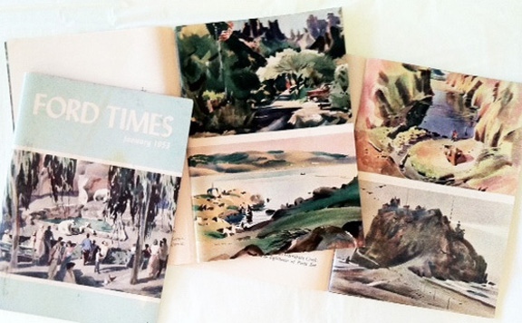 | |
| FORD TIMES - January 1953, June 1956, April 1957 |
So, what does this all have to do with Mom and saying thank
you? Several years ago I was asked about my early interest in painting
watercolors and after mulling that question over a bit, I remembered those
paintings in the FORD TIMES.
After remembering, I thought it was necessary to
say thank you to Rex Brandt who was so influential for me. I’d had two good
chances to say something when I took two workshops from him in the 1980s and I was sorry
I hadn’t, but I hadn’t put it all together then. I was in the midst of raising small
children and felt lucky to carve out a week to go painting!
At last I wrote a note, telling him about my early interest
and how I’d learned about him, my subsequent schooling and teaching and finally
my current situation – painting, teaching and having a gallery specializing in water
media. I told him I thought it was high time I send him my gratitude for his
influence on my life.
Two to three days later, I saw his obituary in the
newspaper. My heart sank! I had waited too long. A week later I got a letter
from his daughter, Joan. A brief note on the back of the service folder read: “I
read your letter to dad on the day is died. He was pleased and so was I. We
will miss him.”
Don’t wait too long. I almost did.
Subscribe to:
Posts (Atom)