Tuesday, November 20, 2012
Watercolor Musings: Learning from Robert E. Wood
Watercolor Musings: Learning from Robert E. Wood: Robert E. Wood (1926-1999) was known for his watercolor landscapes, marine paintings and figures in a semi-abstract style. He earned ...
Learning from Robert E. Wood
Robert E. Wood (1926-1999) was known for his
watercolor landscapes, marine paintings and figures in a semi-abstract style. He
earned a B.A. from Pomona College and an MFA from Claremont where he
studied with Millard Sheets, Phil Dike and Jean Ames. He was elected to the National Academy.
 | |||
| Taxco by Robert E. Wood |
I
was so fortunate to take several workshops from him and in fact met him
and visited his studio while I was in college. His nephew, Ron Wood,
was a classmate of mine and he arranged our visit. During the workshops,
I took notes and several years ago I gathered up those sketchbooks and
arranged his advice in categories. These have been helpful to me and I hope they will be to you too.
 |
| Figure by Robert E. Wood |
Bob Wood on Shadows
• Be aware of the character of form and volume. Look for the shadow shape.
• Softening the edges of 2 vertical, parallel lines rounds form. It turns the area into a tube.
• Shadows are not equal in width - they are thick, thin, etc.
• Shadows are not repeats of the border or the edge of form.
• Cast shadows are hard-edged while form has a rounded edge.
• Look for shadow linkage - where it goes through edges. Too often we stop at every edge without seeing the passage of shadows.
• Shadows blanket a group of things.
• Recreating light exactly can create a "jumpy" painting. Try to simplify the darks so they are more clearly stated, made more understandable.
Bob Wood on Color and Value
• Attempt to take fewer steps from light to dark.
• First washes appear dark because of the comparison to the white page.
• Make a value plan of 3-5 steps. The painting will always be more complicated than the plan.
• Most painters are good colorists in the lights. In the middle values they start to be a little less color conscious and the darks are boring. Bring life to the darks.
• Paste is not as luminous as a thinned liquid dark.
• The first application is never a dark - layering is what causes the darks. Start with a moist color so the paste on top of moist color will dry more "liquid."
• Use a complete palette to create a greater variety of darks.
• Several little paintings can explore different color moods which is more effective than one large painting.
• Be sure the drawing is dark enough to see so the first wash doesn't obliterate it.
Sunday, October 28, 2012
Learning from Millard Sheets
 | ||
| Mosaic by Millard Sheets in the former Home Savings and Loan Tower in Pomona |
- Before you begin, determine where the light starts and stops.
- Establish the lightest light and darkest dark early.
- Worry about shadows on objects later - get the basic value down first.
- Give it hell from the minute you start painting! There is no point covering up pale washes when the object is essentially dark.
- You never get a color by looking at it alone, only by relationships. Don't look at isolated items, look back and forth 4 times. Which is lightest? Darkest? Warmest? Coolest?
- Always work from colors in the same family. Compare whites against whites, blues against blues, etc.
- The greatest colorists in the world are the ones who know the most about muddy color. Mud can be a foil for brilliant color.
- Put the purest, brightest color in first. It's too hard to get pure color later.
- Warm colors always have more weight than cool colors.
- Cool colors suggest atmosphere.
- Generally speaking, the color will come in the half tones, not the lightest tones.
- Don't be afraid of color, it makes a painting rich.
- Anytime two colors are repeated in the same area, it becomes the same place. Don't have a lazy brush.
- Color, to become a miracle, has to be felt. Take time to see it.
Friday, August 10, 2012
Watercolor Musings: Mom Was Right, Say Thank You
Watercolor Musings: Mom Was Right, Say Thank You: It was the best car my 8-year-old self could have wished for…a 1949 Ford Convertible in yellow! The first of only two new cars my ...
Mom Was Right, Say Thank You
It was the best car my 8-year-old self could have wished for…a
1949 Ford Convertible in yellow! The first of only two new cars my parents
would purchase in their lives. We took it to the beach with the top down
and that made the whole experience even more special. My Mom would make each of us two
sandwiches apiece…one for lunch and the other to eat on the way home after we’d
worn ourselves out in the ocean. I remember sand-gritty hands, wet hair and
towel wrapped body in the back seat, being windblown and loving every moment.
What I couldn’t have realized then was that the most
memorable and significant part of that time was the monthly issue of the FORD TIMES that was sent to all customers. In that wonderful little magazine, which
was published to encourage car trips in the United States, were watercolors of
all the places and scenery being highlighted in each issue. I remember pouring
over each installment looking at each painting. I firmly believe that began my
passion for the medium that has only grown over time, both as a painter and a collector.
My favorite paintings were those done by Rex Brandt and truthfully those were
the only ones I remembered until I purchased some issues online a few years
ago.
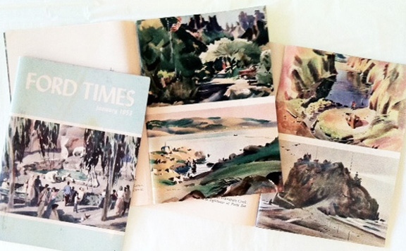 | |
| FORD TIMES - January 1953, June 1956, April 1957 |
So, what does this all have to do with Mom and saying thank
you? Several years ago I was asked about my early interest in painting
watercolors and after mulling that question over a bit, I remembered those
paintings in the FORD TIMES.
After remembering, I thought it was necessary to
say thank you to Rex Brandt who was so influential for me. I’d had two good
chances to say something when I took two workshops from him in the 1980s and I was sorry
I hadn’t, but I hadn’t put it all together then. I was in the midst of raising small
children and felt lucky to carve out a week to go painting!
At last I wrote a note, telling him about my early interest
and how I’d learned about him, my subsequent schooling and teaching and finally
my current situation – painting, teaching and having a gallery specializing in water
media. I told him I thought it was high time I send him my gratitude for his
influence on my life.
Two to three days later, I saw his obituary in the
newspaper. My heart sank! I had waited too long. A week later I got a letter
from his daughter, Joan. A brief note on the back of the service folder read: “I
read your letter to dad on the day is died. He was pleased and so was I. We
will miss him.”
Don’t wait too long. I almost did.
Saturday, June 23, 2012
Watercolor Musings: Benefits for New Painters - Ink & Watercolor
Watercolor Musings: Benefits for New Painters - Ink & Watercolor: Old Oak, Paso Robles All the images in this post were published in "Work Small, Learn Big!" published in 2003 by International...
Benefits for New Painters - Ink & Watercolor
 |
| Old Oak, Paso Robles |
All the images in this post were published in "Work Small, Learn Big!" published in 2003 by International Artist. The work was done on 9x12 handmade watercolor paper, drawn with a rollerball pen, medium point and painted with watercolors.
 |
| The Courtyard, Orange |
A number of years ago I was privileged to be asked to write
a chapter for International Artists’ Magazines book, “Work Small, Learn Big!” I
was one of 17 artists from English speaking countries to do so. It turned out
to be a fascinating collection of all sorts of methods using these basic tools. After teaching this
technique to many students throughout the years, I’ve noticed several exciting
benefits to beginners.
 |
| Vine Street Victorians, Paso Robles |
 |
| Coffee Corner, Orange |
It
keeps you focused. By working quickly, you’ll be more inclined to
concentrate on big shapes and really, truly observe the environment.
It makes you practice drawing. Starting with pen, not pencil, is a huge boost. Unable to second guess yourself once the pen touches the paper, you’ll keep drawing even though corrections need to be made along the way.
It helps you get over perfectionism. When the waterolor is added, some of the drawing lines are blurred so “making it perfect” is no longer a concern.
It encourages you to work outdoors. There is relative anonymity in this approach. With a chair or stool placed against a wall, you become somewhat invisible to passersby, removing the likelihood of over-the-shoulder viewers.
It
keeps you on task. Demanding that the work be completed in a defined time
frame is a sure defense against procrastination.
It builds confidence quickly. The more you do the better you get, period. And that leads to more work which, in turn, gets better and better.
It reduces your stress level. It’s the kind of fun that takes complete concerntration. You can’t worry about anything when you’re so happily engaged in painting.
It keeps you young by engaging the mind and body and teaching you to see the world differently. And the decision making that must be done as you work exercises the brain. I’ve always thought that Ponce de Leon, that seeker of the fountain of youth, had it half right. Not only water is necessary, but so in paint!
Wednesday, June 13, 2012
Watercolor Musings: Who gets the "Creative Gene?"
Watercolor Musings: Who gets the "Creative Gene?": Santa Barbara Mission in pencil and paint. I suspect my affinity for watercolor has lots to do with my love of drawing. I began drawing at...
Who gets the "Creative Gene?"
 | ||||||
| Santa Barbara Mission in pencil and paint. I suspect my affinity for watercolor has lots to do with my love of drawing. I began drawing at a very young age and it has always been a source of enjoyment and comfort for me. Because of that, I've drawn constantly on any paper available at the time. All that practice, even though I did not consider it such, has built my skills as a result. |
I find it interesting to hear people profess their lack of
artistic ability so readily. When I ask how many classes they have taken,
almost always I hear, “None” or “Not since childhood.” When a talented pianist
signed up for a beginning watercolor class with me I found out on the first day
that she had practiced for 2 weeks prior so she wouldn’t look ignorant. I asked
her if she’d done that with piano lessons and of course she shook her head.
Somehow it is believed that “Talent,” with a capital “T” is the reason some can
paint, or draw or create. Furthermore you should be able to do all of it well
with no training at all.
This is easily observed in the elementary classroom. The
children somehow assign the title of “artist” to one of their peers and then
back away as if they should not excel themselves. The assigned artist accepts
the title happily. On the day I demonstrated for my sister’s 2nd grade
classroom, I watched the interaction of the children when I gave them an
assignment. When I complimented others than the chosen artist, they were
tickled but the boy who considered himself the only artist in the room got a
grumpy face. Sadly, the community at large believes that at birth some are
given the “creative gene” while others are not and that’s the end of it.
Sorry…wrong! Drawing and painting and design proficiency are
gained the way all other disciplines are…by work and repetition and tenacity.
Are some more inclined to do art? Probably. Just as some are more inclined in
other areas it is true here. That interest and inclination or encouragement
lead to practice that is completely enjoyable. And practice leads to competency.
Simple as that.
I knew this internally and then stumbled upon an article
published in Fortune on CNNMoney.com. Geoffrey Colvin wrote about, “What It
Takes To Be Great.” I have read portions to countless classes and watched their
self-inflicted boundaries expand.
The article can still be accessed on the Internet by typing
in the title and author’s name. It explains the scientific study behind the
conclusion that targeted natural gifts don’t exist. Nobody is great without
work. It is a fascinating article well worth the time it takes to read. And it
is encouraging to those of us who will never be “great” but want to expand our
horizons with the time we have.
I always think of Dwight Strong, my friend who began
painting at 69 years and became such a wonderful painter that when he died in
his mid-80s, he left a huge body of work. And this work was collected by some
of the artists whose workshops he had taken. He was single-minded and focused
on his goal. One time he told me that he had taken 50 workshops. When I exclaimed
over the number he told me, “Judy, I don’t have any time to waste!” I am
fortunate to own several of his paintings.
Friday, April 27, 2012
Watercolor Musings: Designing Images with Meaning - II
Watercolor Musings: Designing Images with Meaning - II: This is a continuation of the initial blog about designing images with meaning. These creative problems are fun to do and I usuall y "thro...
Designing Images with Meaning - II
 |
| The Railroad |
The composition of this particular painting gave me a bit of
trouble. The positioning of the buildings represents the existing 1930’s era
station in the foreground and the Victorian station in the rear or in the past.
I learned that in actuality the Victorian station was to the south or to the
right of the current station. If you visit the station you can see the space
between the trees and the buildings. I tried several times to make the composition
accurate by having the Victorian Station in the foreground. It just wouldn’t
work so I finally returned to my first thought.The railroads had a huge impact on the settling of the west so this was an important part of the story to be told.
While designing this painting a
real serendipity occurred. I was speaking wishfully about the image of the
train stations and the possibility of having an old train ticket to help as a
transition between the old and new stations. Not two days later, Bobby McDearmon came in the gallery and asked
me if I’d like to have an old ticket to use as reference…it seems he was
talking to Lisa Ackerman, a friend and shop keeper around the corner and she
had been here when I was verbalizing my wish. He specializes in historical
ephemera and has an extensive collection that is Orange based. The rail ticket
he loaned me for this piece was issued August 1, 1892.
 | ||
| The Citrus Industry |
Whereas there was a dearth
of information and images for some of the paintings, this subject was so rich
in material that my job was to make the difficult decision of what to include.
Since the Santiago Packing House was at one time the largest Valencia packing
plant in the world, their label became the largest image in the painting.
Choosing a packinghouse proved not only difficult but rather uninteresting
shape-wise. The truck became a representation of all the packinghouses, was
interesting and color-wise was a real addition once I found out what color this
old truck was. Pictures for this project were almost all in black and white so
I called on friends with expertise when needed. The grove, fading off into the
distance filled the outer areas of the piece and lugs of oranges with the addition
of a picking sack filled the lower left hand corner nicely. This composition
has some personal meaning since I grew up on groves in San Diego County and was
well acquainted with the equipment. And adding to that connection, my neighbor
for many years was President of the Santiago Packing House.
 | ||
| Early Agriculture |
Agriculture and animal husbandry
that was not citrus is the theme for this image. A tall vine of grapes frames
the painting, which includes apricots, walnuts, avocados, grain, chickens, row
crops, dairy cows and pumpkins. The pumpkins were a late addition. I had
purchased a new book of Orange Place Names by Phil Brigandi just before I began
the paintings. At one time West Orange was called “Pumpkinville” by the
residents. I needed another warm color and decided to include the fall
squashes.
As I said in the first blog on these images, they are part of placques outside part of the perimeter of the library building. People need to be able to grasp the meaning of the image and have time to read the brief history also on the placque. All the original paintings are framed and on the second floor of the library next to the history room.
Friday, April 13, 2012
Watercolor Musings: Designing Images with Meaning - I
Watercolor Musings: Designing Images with Meaning - I: Several years ago I was asked to do a series of paintings for a History Walk around part of the new Orange Public Library an...
Designing Images with Meaning - I
Several years ago I was asked to do a series of paintings for a History Walk around part of the new Orange Public Library and History Center. It turned out to be much more of a design problem than a painting project. Certain images were requested and I had the history notes from Phil Brigandi which were to accompany the paintings. I made the paintings much more graphic than I normally paint since the images and history notes were to be transferred to a stone-like material and the idea was that library visitors could walk along and quickly grasp the image and pause to read the notes.
 | ||
| Overview and Welcome |
With such a general theme, I was
having difficulty coming up with an image. Head Librarian Nora Jacob came to my
rescue with the idea for the book and background of the earth and space behind.
I wanted to put in some of the interesting tidbits of history within this
larger idea and the book gave me the inspiration – bookmarks, of course. Each "ribbon" holds some early history - the only difficulty here was choosing what to include.
 |
| Center Street for the Library |
If the first painting was a
challenge to imagine, the second was just as ephemeral. This was the last
painting done in the series. Once the idea that the Chapman Avenue and Center
Street as division lines were “seen” as ribbons then the rest followed nicely.
The three versions of the library are depicted in the lower right corner of the
painting – stacked upon one another so as to show the relative sizes of each
building. The rose is the city flower so a bouquet makes up the largest part of
the painting and ribbons with historical notes are again used to convey
information. The most interesting to me was learning that Center Street was
extended to Chapman Avenue in 1908, having originally been closed off. The
newest rendition of our library returns the street to its original
configuration. The ribbons again provided a space for bits of history.
In all there are 14 paintings. I will add them in subsequent posts.
Friday, February 17, 2012
Diagnosing with Drawing???
 |
| Drawing and re-drawing in the Czech Republic |
 |
| Pillow, Teapot and Zicam |
 |
| Crooked Tower |
The experience taught me something. Perhaps drawing is an early warning system for me when I'm about to be pounced upon by a germ. I'm going to pay attention to my skill level. This is a good impetus to draw everyday!
May you stay well and draw straight!
Thursday, February 2, 2012
Watercolor Musings: Reflections for Dessert
Watercolor Musings: Reflections for Dessert: Reflections on two types of glass - transparent and opaque Dessert! What an assignment! The two glass objects gave me a good opport...
Reflections for Dessert
 |
| Reflections on two types of glass - transparent and opaque |
 |
| Dessert! |
When looking for shapes in reflective surfaces, plan on painting around the lights in an opaque object and paint the shadowy shapes on the clear one. Squinting your eyes helps the lights pop and they are easier to see. I drew with a small water soluble pen first, added watercolor to the to the cake within the dome. The shapes and reflections were painted after that.
Choosing appealing subject matter is easy if you open up your eyes to your everyday life. Sometimes the most common of subjects make the most emotionally powerful work...we are connected to those things.
So...consider this your assignment...go get some yummy desserts and paint them...and then test them!
Thursday, January 19, 2012
Watercolor Musings: Workshop Etiquette
Watercolor Musings: Workshop Etiquette: The following is a list I am now sending to those attending a workshop in our studio. If it is helpful, feel free to take from it and pl...
Workshop Etiquette

Schroeder Studio Gallery Workshop
Etiquette
We
are so pleased that you have joined us for this workshop. We want you to have a
wonderful time and that the learning will be helpful in your growth as an
artist. The suggestions below are intended to make the workshop a positive and
pleasurable experience for all. They are gleaned from many workshops since
1998.
•
Please turn the sound OFF or set to “vibrate” on cell phones when class and
teaching begin. Ringing interrupts the instructor’s train of thought and is
annoying to your fellow painters. If you need to take a call, please step
outside to do so.
•
Be on time. If tardiness is unavoidable, please quietly try to catch up – the
instructor is not expected to start the lesson over.
•
When packing materials for the class, do include the necessary but please leave
your “studio” at home. We have limited space for each student.
•
Please arrive at class fragrance free for the comfort of participants and
instructors who may have allergies.
• Please don’t be demanding
of the teacher’s time. There is a room full of people who paid for the
workshop, too.
•
It is a courtesy to ask permission from the teacher before taking pictures of
samples and demonstrations. This goes for photographing other students and
their work as well.
•
All handouts and instructions are copyrighted and owned by the instructor.
Individual teachers have varying policies as to how their designs, handouts and
instructions may be used after a workshop. Please check
with your teacher before sharing the workshop materials in any form with
others.
• Be courteous to your tablemate.
Conversation might be enjoyable to you but others may require total
concentration and listening to constant chatter is disruptive.
• Be honest of your level of
experience. Don’t expect the teacher to know.
• Please, under no
circumstance, touch or take any of the demonstration pieces or artwork unless
you have permission from the teacher.
•
Please don’t eat or drink in the gallery. Also do not eat food or drink over
anyone’s artwork.
•
Then, first and foremost, ENJOY & HAVE FUN!
Subscribe to:
Posts (Atom)